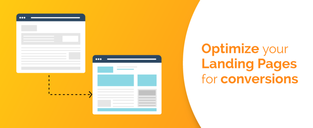
Are your landing pages doing their job of getting leads? Does a large number of people visit them without converting? Are you having trouble getting visitors to convert? Then it’s a time to pay attention to optimize your landing pages for conversion. The term conversion means sales.
Whether you’re using landing pages to gather emails or make direct sales, optimizing your landing pages for the conversion is essential. The purpose of a landing page is to increase the conversion rate. Just in case you’re wondering what conversion rate is? Well, the conversion rate is the percentage of website visitors who take a specific action after visiting your landing page.
Use these seven tips to optimize your landing pages for conversions.
1) Have a goal-oriented strategy
Before you start building a landing page, you need to have a strategy. Like any marketing campaign, the strategy is crucial that outlines how your landing pages will perform. Your aim is not to build something that looks nice but build something that meets your specific goal.
Choose 2 to 3 goals for your landing pages that help you to develop a strategy to reach those objectives. The overall goal for any landing page is to encourage visitors to perform a specific action with limited distractions.
Some distinguish goals your company may be looking to achieve with its landing pages include:
- Increased subscribers, leads or customers
- Successful up-sells or cross-sells
- Boost engagement on social media
- Growth in revenue
- Increase videos views
- Encourage downloads and more
2) Keep it Clean
If you have a goal for your landing page, make sure the goal is clear to the visitor. Keep landing pages free of clutter and extraneous information or links to increase conversion. One of the biggest problems with most landing pages is that they lack focus on one specific goal. A landing page with multiple offers confuse visitors and make them lose the conversion aspect of the landing page.
If you’ve one specific goal, make the user act on that goal on that particular page. Just make them do what you’re asking them to do.
For example, this landing page gives the user only one option- Get a Quote. Here, the landing page’s sole purpose is to encourage visitors to get a quote and, in turn, generate a lead. Well, this is a perfect example of keeping things simple and free of clutter, making it easier for landing page visitors to take action. You aim to make your visitors stay on the page not to chase them. Another thing that looks well on this page is its use of colour. The colour establishes a connection with landing page visitors and increases conversions.
Different colours reflect different moods, so choose colours wisely. According to Neuromarketing, “If a good colour sells, the right colour sells better.” While designing a landing page, take into account the colour psychology to use colours strategically.
Let’s know about some colours in terms of creating emotions.
- Red: Love, passion, power, anger and danger.
- Yellow: Optimism, energy and happiness.
- Orange: Energy, vitality and happiness.
- Green: Rebirth, life, health, wealth and growth.
- Blue: Trust, confidence, loyalty and security.
- Purple: Creativity, nostalgia, royalty and wealth.
- White: Innocence, purity and perfection.
- Black: Elegance, sophistication and efficiency.
3) Keyword focused pages are great for SEO
Browsers are more likely to find landing pages on the internet through Google searches. A landing page dedicated to a specific keyword is more likely to rank higher in people’s searches.
For example, your travel company has a dedicated landing page for flight booking, another for train booking, and another for hotel booking. When people search for any of these services online, you have a good chance of being featured on top of Google search results pages.
Well-optimized landing pages allow marketers to take the prospects that they attract to their landing pages and convert them into leads.
4) Add social proof
Add social proof to your landing pages to increase trust in your business and also boost the conversion rate. Trust is crucial if your brand is not a household name. Show your visitors your happy customers, testimonials, ranking, association with other companies, and it goes a long way to create an impression.
Good landing pages include a variety of trust-building elements, including:
- Testimonials & reviews
- Customer success stories
- Number of subscribers
- Client logos
- Third-party certifications
- Security badges
5) Optimize for mobile
Mobile internet usage has surpassed desktop and is rising continuously. 80% of internet users are on a smartphone. Your landing pages must be mobile responsive when it goes live. So, make sure your landing page design looks great, loads and responds quickly on desktop as well as mobile devices. It should also allow visitors to navigate with ease.
6) Quick to Load
Loading time matters! Visitors have no patience to wait for the page to load. Page load speed plays a critical role in user retention and conversions. Your landing page must load within a few seconds, or else visitors might leave the page. Fast loading leads to higher conversion rates; whereas slow loading increases the bounce rates and a reduction in conversions. Tommy Walker has correctly said, a good first impression isn’t just about design, but also how fast that design loads. Test page speed with Google PageSpeed Insights and fix the issues to reduce page loading time.
7) A/B test your landing pages
How will you check the functionality of landing pages? Do A/B test to test your landing pages and see how each element are working. You can A/B test headlines, copy, call to action, landing page, button design, or pretty much any other element of a page. A/B test let you see how the changes affect your conversion rates.
At any moment you want to change something on your landing page, A/B test it. Testing helps you continuously improve results and to find out what works and what doesn’t. A/B test is the way for you to improve your landing page conversion rate.
Conclusion
Optimizing your landing pages for conversion will ensure that your landing page is enticing visitors to take whatever action you want them to take. The above seven tips will give you an idea to design each element of the landing page that help visitors move from the prospect to buyer category.


